|
Government Services Infrastructure - GSi |
 |
|
Save Process opened from Server Drag and Drop modeling constructs Route Activity/Decision Point/XOR Split Create New Application (Auto-Activity Definition)
Overview
This document explains in detail the functionalities of the GSi Modeler tool. This document will help the intended users to understand and use the GSi Modeler tool. IntroductionGSi Modeler is the graphical process modeling tool. This tool provides a visual modeling environment using which users can model their process. Following are the features of the modeler tool. Features: · Stand-alone based tool · Visual modeling of the process · Intuitive drag and drop features to model the process using the constructs · Role based modeling and retrieval of process, rules and activities · Support the following workflow constructs for modeling: o Activity – Automated and Manual (User) o Sequential Processing o Decision o Split – Parallel processing, conditional multi-path processing o Join o Transition/Association/Link o Sub-Process : Spawn and Call to other Process o Activity Set – transaction and compensation o Deadlines – Synchronous or Asynchronous (Remainders) · Support Process Version · Process Verification
Getting StartedTo install GSi Modeler, you need to have the JRE 1.4.2 or above to be installed on the machine. Once the JRE is installed, run the GSi Modeler Tool installer and step thru to screens to complete the installation.
To run GSi Modeler,
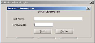
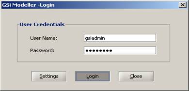
This will launch the modeler tool. Server Information and LoginThis section describes the steps involved in login and initial configuration settings that needs to be done.
Figure 1:First time Login · GSi Modeler Login
Figure 2:Server Information
Figure 3:Login Screen
First LookThis section details the main screen of the modeler tool and explains the various areas in the main screen in terms of their purpose and usage.
Figure 4:First Look At Modeler
Figure 5:Modeler Name Top Bar
Figure 6:Modeler Resize Top Bar · As Show In Figure 6 Red Circle Shows Minimize button to Minimize the Modeler · As Show In Figure 6 Blue Circle Shows Resize / Maximize button to Resize / Maximize the Modeler · As Show In Figure 6 Green Circle Shows Close button to Close the Modeler EditorsThis section details the visual modeling editor provided in the Modeler and various views supported. This section gives an overview of the functions available as part of the modeling. DesignWhen user double clicks on Process which is in a Tree (Navigator View Explained in Views - Navigator) Design View (Figure 7) comes. And When user opens the Process from (File -> Open / Open button in Tool Bar) Design view (Figure 7) comes. In this view, modeling of the process can be done using the various constructs provided in the modeling tool bar. The various constructs can be created by drag-and-drop on to the modeling panel.
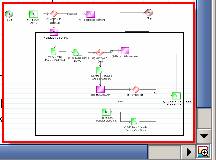
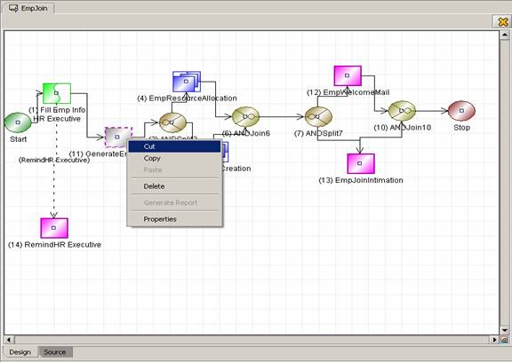
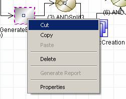
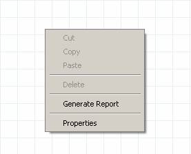
Figure 7: Design View Once the file is Open the Design editor has the following components in it · In Figure 7 Red Oval Indicates Icon and Name of The Process which is currently being selected (Selected Tab). · In Figure 7 Orange Oval Indicates Icon and Name of The Process which is not being selected. · In Figure 7 Black Oval Shows Scroll button Shown because more number of Tabs got Opened Right Arrow to Move right and Left Arrow to Move Left. · In Figure 7 Blue Circle Indicates Close button to close the design view · In Figure 7 Maroon Oval Shows Two Tabs to Switch between Design and Source (Explained in Editors – View) · In Figure 7 Green Circle Scroll Bar and View button On click on View button It shows the Figure 8 Figure 8:View Design Content · In Figure 8 Red Block Shows the Completed Design Editor in Small view with Black block is mouse pointer · Using mouse pointer we can see that part of the process design in design editor Figure 9:Design Editor with Popup Menu The Popup Menu is shown in Figure 9 which has the following behavior
Figure 10:Popup Menu with Single Component Selected
Figure 11:Popup Menu On Design Editor with No Component Selected
SourceWhen user double clicks on Process which is in a Tree (Navigator View Explained in Views - Navigator) and then press Source Tab (Below Left) Source View (Figure 7) comes. And When user opens the Process from (File -> Open / Open button in Tool Bar) and then press Source Tab (Below Left) Source View (Figure 7).
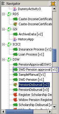
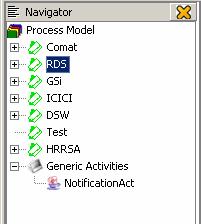
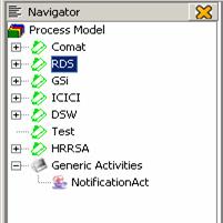
Figure 12:Source View Once the file is Open then click on Source Tab which is (Below Left) To View Source Editor · In Figure 12 Red Oval Indicates Icon and Name of The Process which is currently being selected (Selected Tab). · In Figure 12 Orange Oval Indicates Icon and Name of The Process which is not being selected. · In Figure 12 Black Oval Shows Scroll button Shown because more number of Tabs got Opened Right Arrow to Move right and Left Arrow to Move Left. · In Figure 12 Blue Circle Indicates Close button to close the Source view · In Figure 12 Maroon Oval Shows Two Tabs to Switch between Design and Source (Explained in Editors – View) · In this view, the process model XML can ONLY be viewed and cannot be modified. ViewsThis section explains the various views/windows in the main screen of the Modeler tool. NavigatorShown in Main Screen of Modeler (Left Top). Figure 13 shows Navigator view. In the window, the vertical wise processes and activities are displayed in a tree format. The root level nodes are the verticals running on GSi and one node named as “GSi” for GSi, Also at the root level, there is a node “Generic activities” which contains generic activities provided by GSi which can be used across verticals like NotificationAct. The various types of nodes are explained below.
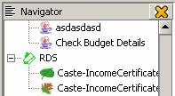
Figure 13:Navigator View · Top Bar In Navigator shows the Icon, Name and Close button to close the Navigator · Once Navigator closed we can get that back from (File Menu -> View -> Navigator) · In Figure 13 Red Oval Shows the Vertical Name Which is node. · In Figure 13 Blue Oval Shows the Application Name Which is leaf. · In Figure 13 Maroon Oval Shows the Process Which Saved and Deployed in the server (Explained in Sample Process – Make Deployable). · In Figure 13 Black Oval Shows the Process Which Saved and Not Deployed in the server. And its can be deployed by GSi Admin. And available to deploy. · In Figure 13 Green Oval Shows the Process Which. And it’s not available to deploy. · In Figure 13 Blue Square shows the complete name of process if it’s exceeding the Navigator width. · All the nodes and leaf are loaded from Server that’s depend user privileges.
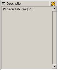
DescriptionShown in Main Screen of Modeler (Left Below Navigator). Figure 14 shows Description view. The Description view/window shows the description provided for the selected process or a process construct like activity, split so on
Figure 14:Description View · Top Bar In Description shows the Icon, Name and Close button to close the Description · Once Description view is closed we can get that back from (File Menu -> View -> Description) · Description shown in different way. If User selected Process / Vertical in Navigator then in it shows the name of Process / Vertical. · If User selected any component in Design Editor (Explained in Editor – Design) then it shows description for the selected component.
Modelling components toolbarShown in Main Screen of Modeler. Figure 15 shows Modelling components toolbar.
Figure 15:Component Pallet · Can be removed and can get back from (Menu Bar View -> Modeling Components) · It has buttons to create / design the process. Deselect, Start, Stop, Manual Activity, Automated Activity, Route Activity, AND Split, OR Split, AND Join, OR Join, Transition, Exception Transition, Deadline Transition, Reminder Transition and Block Activity. Menu BarShown in Main Screen of Modeler (Top). Figure 16 shows Menu Bar. This bar is used to perform the various functions provided by the modeler tool.
Figure 16: Menu Bar · Menu Bar Contains Five Menus 1) File · Work Offline · New Process · New Application · Open · Close · Close All · Save · Save All · Save As · Save As Image · Save To Server · Make Deployable · Recent Files · Change Password · Exit 2) Edit · Undo · Redo · Cut · Copy · Paste · Delete · Select All 3) View · Navigator · Description window · Modeling Components · Status Bar · Tool Bar · View Grid · Full Screen · Zoom (Zoom In, Zoom Out, Normal) 4) Tools · Create(Start, Stop, Manual, Automated, Route, And Split, Or Split, And Join, Or Join, Block, Activity Set, Break Activity Set, Transition, Exception Transition, Deadline Transition, Reminder Transition) · Nodes(Align, Rearrange) · Verifier · Simulator · Generate Report · Preferences 5) Help · Contents · Manual · About GSi Modeler
Tool BarShown in Main Screen of Modeler (Below Menu bar). Figure 17 shows Tool Bar.
Figure 17:Tool Bar · Can be removed and can get back from (Menu Bar View -> Tool Bar) · It has buttons for New Process, New Application, Open, Save, Save All, Print, Cut, Copy, Paste, Delete, Undo, Redo, Zoom In, Zoom Out, Normal, Full Screen, Preferences, Simulator, Report Generation, Verifier and Help.
Status BarShown in Main Screen of Modeler (Below). Figure 18 shows Status Bar.
Figure 18:Status Bar · Can be removed and can get back from (Menu Bar View -> Status Bar) · Shows the Status – In design time shows which Component is selected. · And Status like Cut, Copy and Paste are shown.
ToolsThis section explains the various tools provided in the modeler tool. The tools can be invoked from the menu bar by accessing the “Tools” menu VerifierIt is a tool to verify the Process whether it is valid process or not. The verifier for the proper usage of constructs, the way the transitions are built and attributes specified. Though processes which are not valid can be saved to the local machine/server, only valid processes can be made deployable. (Verifier runs on the Current Process which is shown i.e. Process in Selected Tab) Verifier can be invoked through the following two options. · Menu bar Tools -> Verifier · Tool Bar Verifier (Figure 19) Figure 19:Verifier Button in Tool Bar The verifier displays an appropriate message after it completes verification of the process. If the verification of the process is complete “No Errors found” / “Verified successfully” displayed. Due to some reason the verification has failed an appropriate error message is displayed, indicating the cause for failure Generate ReportA report of the Process can be generated. This report contains a detailed description regarding who can initiate a process, the participants for this process, and the activities and its input and output parameters.
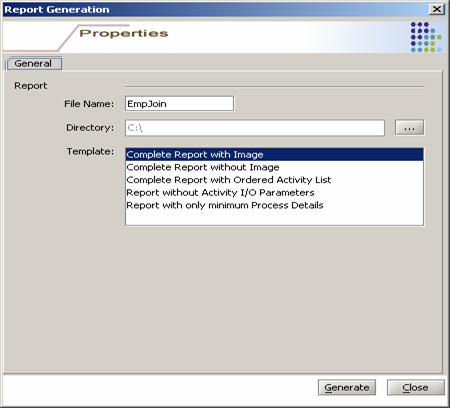
Generate Report can be invoked through the following two options. · Menu bar Tools -> Generate Report · Tool Bar Generate Report (Figure 19) Figure 20: Generate Report On Selection of Generate Report (Figure 21) the Report Generation window is displayed.
Figure 21:Generate Report Tool · Report is generated in HTML format (.html) · In Figure 21 Red Oval shows the name of the process on which report generated and the same is used to save report file name. · File Name can be changed. · In Figure 21 Blue Oval Figure 22:Report Generate Choose Directory Button Click on the button (Figure 22) to choose directory where the report file should get saved. · Template List Shows 1) Complete Report With Image 2) Complete Report Without Image 3) Complete Report With Ordered Activity List 4) Complete Report without Activity I/O Parameters 5) Report with only minimum Process details Select One of The report and template to generate report of that template.
Figure 23:Report Generate Button Click on Generate button (Figure 23) to generate Report. On successful generation of the report “Report Generated” messages is displayed. If any errors encountered during generation of report an “Error Message” is displayed Click on Close button to close the Generate Report Dialog
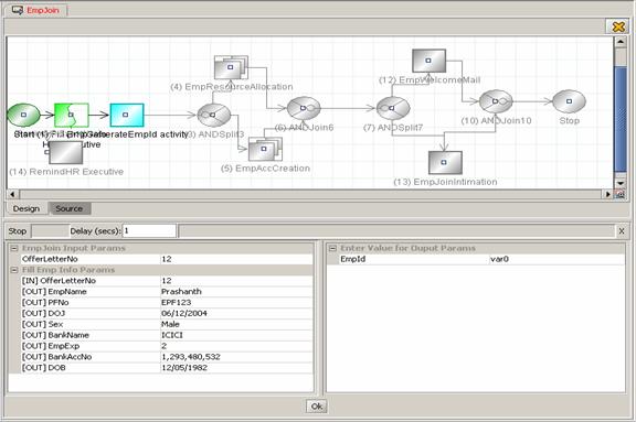
SimulatorSimulator is used to simulate the selected process to check how the process is flowing through. The simulator works in a interactive mode by asking the user for process inputs and activities outputs. By default the process input and activity output attribute values are auto-generated. This can be modified by user and simulation proceeds to the next logical activity. To start Simulation (Simulator runs on the Current Process which is shown i.e. Process in Selected Tab) · Menu bar Tools -> Simulator · Tool Bar Verifier (Figure 24) Figure 24:Simulator Button On Tool Bar
On Click of the simulator button, the simulation panel is displayed in the design view of the editor. The Process Tab becomes like the one shown in Figure 25. With Simulator Panel (which takes Input to Start the Process, Output values to complete Activity and values for route activity to take decisions/paths in the Process) At the end of Simulation it shows the path taken to complete the process. (Highlights the name of activities which are visited).
Figure 25:Simulator With Process · In Figure 25 Red Oval Shows the Process on which simulation is doing. · In the Graph highlighted activity shows the path taken. · Activity with light blue color indicates current activity in the simulator. · The path taken to complete the process is highlighted (Green for Manual Activity and Red for Automated Activity). During the process simulation some activities may not be visited (indicated by the blur color) Figure 26 Shows Only the Simulation Panel.
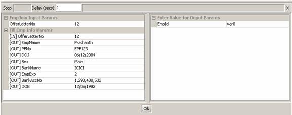
Figure 26:Only Simulator Panel · In Figure 26 Red Circle shows the button to Start / Stop Simulation. · In Figure 26 Blue Oval shows the Delay - Is between the each activity simulation time. · To close the simulation panel use the close icon at the top-right hand corner. · Ok button to simulate execution of next activity and also to take Input Parameters for Process / Output Parameters of Activity · Left Side Panel shows the Process Input Parameters as the First Node. · Next node shows the Process Context / IO Parameters of each activity that comes into simulation · Right Side Panel takes the Values for current simulating activities out put parameters. · In Figure 26 Green Oval indicates [IN] – Input Parameter to the Activity / Process [OUT] – Output Parameter from the Process / Activity. · In Figure 26 Black Oval shows the name of the Process.
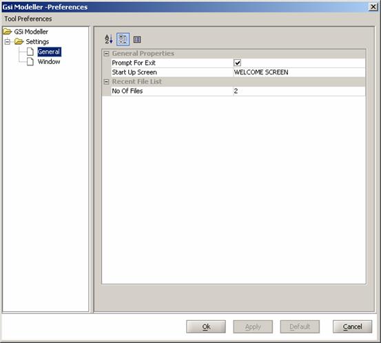
PreferencesUsers can set preferences for certain properties like Welcome Screen at Start Up, Prompt when exiting and the number of files available under the Recent Files etc To Set User Preferences · Menu bar Tools -> Preferences · Tool Bar Preferences (Figure 27) Figure 27 :Simulator Button On Tool Bar Click on the Menu Item / Tool Bar button to get the Preference Dialog shown in the Figure 28
Figure 28:Preferences with General Components Shown
(Menu bar File ->Exit) · Start Up Screen – Choose Wel Come Screen or Any Selected Process · No Of Files – Count shows how many number of Recent Visited files to show in (Menu bar File - > Recent Files ->File Name) (Figure 29) shows the same. Figure 29:Recent Files in File Menu
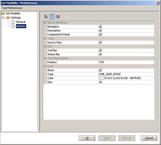
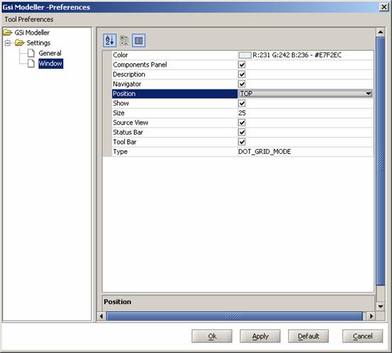
Figure 30: Preferences with Window Components Shown · Show / Hide Navigator, Description and Components Panel · Show / Hide Source View (As Explained Editor -> Source) · Show / Hide Toolbar and Status bar · Tab (Process Tab) Placement Like (TOP, BOTTOM, RIGHT and LEFT) · Show Grid. (Explained with Figure 11) Can choose different type, color and size with visibility mode.
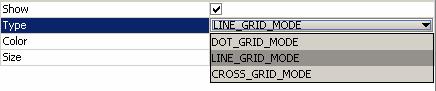
Figure 31:Preferences with Grid Selection Type · For Type Selection of Grid there is Combo box provided. 1. LINE_GRID (Figure 32) 2. DOT_GRID (Figure 33) 3. CROSS_GRID (Figure 34)
Figure 32:Grid Line Grid Figure 33:Grid Dot Grid Figure 34:Grid Cross Grid
Figure 35:Preferences Tool Bar · Preferences Tool Bar is as in (Figure 35) · First button to Sort the values (rows) in A-Z Order. · Second button to Show / Hide Tree Table facility. · Third button to Show / Hide description panel.
Figure 36:Preference Button Panel
Figure 37:Preference With Tool Bar Buttons Changed
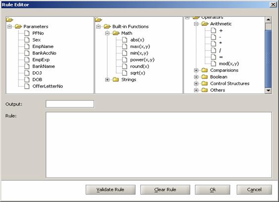
Rules EditorRules Editor is used to Create, Validate and Save rules for Route Activity like Decision Point/XOR Split, OR Split and also for Transition. Rules are specified in JavaScript language. The editor provides a visual modeling/specifying of the rules. Most of the scripting constructs like conditional checking, loop constructs, arithmetic and logical operations are provided and can be used in a visual drag-drop mode.
To Open Rules Editor
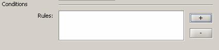
Figure 38: Rules Editor Open Window · Figure 38 Shows the Rules List with + and – · + to Get Rules Editor (Figure 39) and – Remove rule in the Rules List
Figure 39:Rules Editor
1. Arithmetic (+, -, *, = , /, mod) 2. Comparison (==, <=, >=, != , >, <) 3. Control Structure (if… else, if….else if) 4. Boolean (AND, OR, NOT) 5. Others
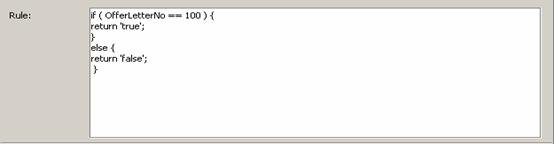
Figure 40:Rules Editor with Rule
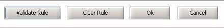
Figure 41:Rules Editor Button Group · Validate Rule – Click on button to validate rule to which is entered in Rule area. “Valid Rule! You can save it” Message displayed if rule is valid. Else appropriate “Error Message” is displayed. · Clear Rule – Click on button to clear rule which is in Rule Area. · Ok – Click on button to save rule to (Activity / Transition Property) (As Explained in Tasks – Add / Edit Activity Property , Tasks – Add / Edit Transition Property) · Cancel – Click on button to Clear Rule and close the rule Editor. TasksThis section describes the various tasks available as part of the Modeler tool. Save Process opened from ServerOpen Process (Tasks – Open Process – Open From Server). Then Go to Menu Bar (File –> Save Ctrl-S) or Tool Bar (Save Button). (Figure 42) Figure 42:Save Button from Tool Bar
Figure 43:Save Process from Server · Select directory to and Click on Open button then process will get saved into that directory. File Name is same as Process Name Open ProcessTo Open Process (which is in .xml) files.
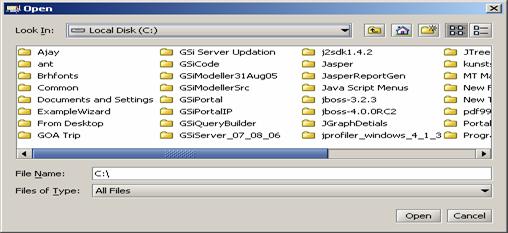
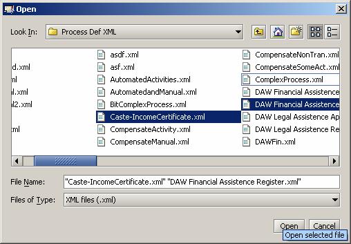
Figure 44:Open Process From Local Machine Click on the Open button (Figure 44) in Toolbar or Select Menu Item (File -> Open Ctrl-O) Then File Chooser (Figure 45) Opens and allows to select process files (.xml). Can open Single / Multiple Files from the same file chooser. Depends on the process vertical files will get open else appropriate error messages will get displayed. 3. Open Recently Visited files – Modified and Saved Local files (File -> Recent Files -> Select Files shown in the list)
Figure 45:File Chooser to Open Process Files
Close ProcessTo Close Process
Figure 46:Close Tab Option
Save As ImageTo save the process model as an image (.jpg) – Open any Process (Tasks -> Open Process). And choose Menu Item (File -> Save as Image) to save the image of process. As Shown in Figure 47 Red Square part of Design Editor will get saved as (.jpg / .png) format of image.
Figure 47:Save As Image Part
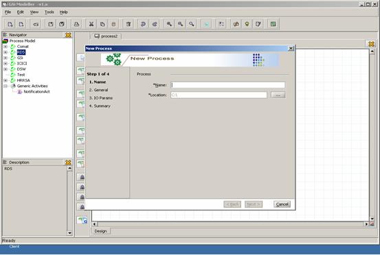
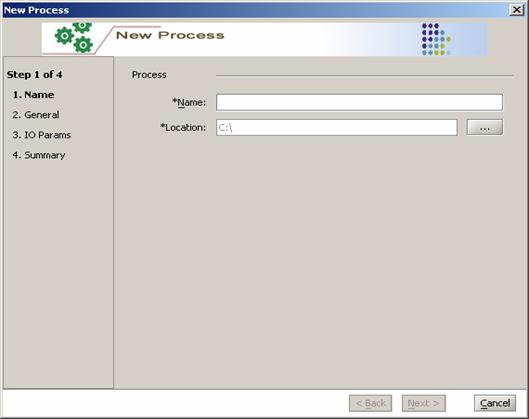
Create a New ProcessNew Process thru wizard
Figure 48:Vertical Selection from Navigator View
Figure 49:New Process Button
Figure 50:New Process Dialog With Main Screen
Figure 51:New Process Wizard Name Panel
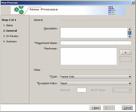
Figure 52:New Process Wizard with General Panel
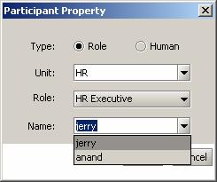
1. Enter Description in Description Field 2. Enter Department Name in Department Name Field 3. To Add Performer click on Button (Figure 52 Red Oval) will open dialog (Figure 53). This show List of Participants in that select the participants and then press Ok button to add them as Performer.
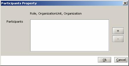
Figure 53:New Process Add Performer · Add button Figure 53 Red Oval - Click on To add Participants to List (Figure 54) · Select Participants in the List and Press Remove button (Figure 53 Blue Oval) Figure 54:Participants dialog · Two types of participants can be defined in a Process Role and Human · On click of Unit and Role will get populated. · Select Unit then Role is in the Unit will get populated. · Then if any user is present in the selected Role then there names will get populated in the Name drop down. · User can also enter new Name in the same. · Press Ok button to add the participant to the Participants list.
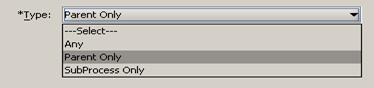
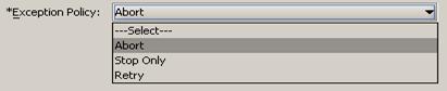
4. To Select Process Type (Figure 55) Figure 55:New Process Type Selection There are Three Types of Process Any – Can act as Parent Process and also as Sub Process Parent Only – Only can act as Parent Process can’t be sub Process of any other process Sub Process Only – Only can act as Sub Process. Can’t be Parent Process 5. To Select Process Exception Policy (Figure 50) Figure 56: New Process Exception Policy There are Three Types of Exception Policy Abort - The process is aborted when an unhandled exception occurs. Stop - The process is stopped and can be restarted by resolving the exception, when an unhandled exception occurs. Retry - When the process aborts due to an activity failure, the aborted activity is retried based on the no of times and interval specified.
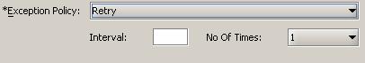
Figure 57: New Process Retry Exception Policy As Shown in Figure 57 on selection of Retry Exception Policy Need to Provide Interval time in Second and No Of Times to repeat which is again a drop down to select how many number of times to repeat
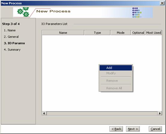
Figure 58:New Process Wizard with IO Parameters Panel
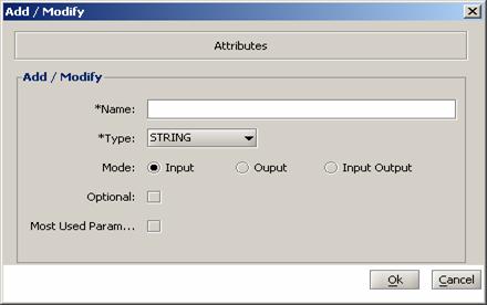
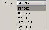
Figure 59:New Process Add Parameters dialog To add Parameter to New Process Enter following details. 1. Name - Name of Parameter In name filed. 2. Type - Type of Parameter select from drop down. (Figure 60) Figure 60:New Process Add Parameters dialog Parameter Type 3. Mode - Mode of Parameter Input, Output, I/O 4. Optional - Optional Parameter to Process 5. Most Used Parameter –Common Parameter need in most of the activities of the process. 6. The Select Ok button to add Parameter to List and Cancel button to exit the dialog
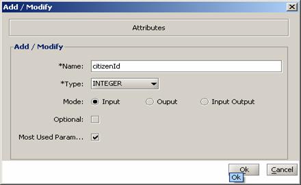
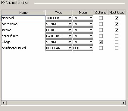
Figure 61:New Process Add Parameters dialog with Data Figure 62:New Process with IO Parameters List example Figure 62 shows List Process Input Output Parameters · In Order Name, Data Type, Mode, Optional and Most Used details shown for each parameter. · In Figure 62 certificateIssued Parameter is the only one as Output Parameter all other are input Parameters. · In Figure 62 village Parameter is the only one as Optional Parameter all other are mandatory Parameters.
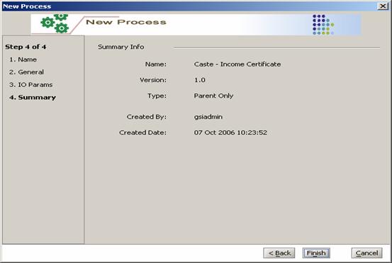
Figure 63:New Process Wizard with Summary Panel
Figure 64:New Process with Design Editor
Figure 65:New Process with Source Editor
Drag and Drop modeling constructsTo design Process Use – Components Panel (Views - Components Panel) and Design Editor (Editor – Design)
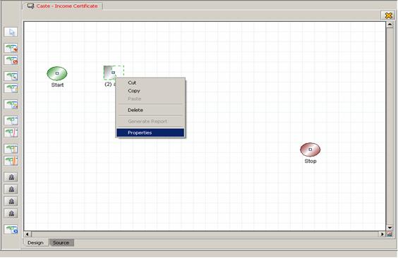
Figure 66:Process Put Components Manual Activity To add Components to Design Editor Click on Component Panel (Component will get selected) then Click on Design Panel (Component will get places on Design Panel). Then Select any Component and right click to get Popup menu as shown in Figure 58. Select Properties to set properties to that Component. The list of components available is as follows. 1. Start 2. Stop 3. Manual Activity 4. Automate Activity 5. Route Activity 6. AND Split 7. OR Split 8. AND Join 9. OR Join 10. Block Activity 11. Transition 12. Exception Transition 13. Deadline Transition 14. Reminder Transition Each One is explained as. StartIt’s shown as in the Figure 66 with Green block. No need to set any properties to this. Just connect From this to First Activity of the process.
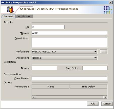
StopIt’s show as in the Figure 66 with Red block. No need to set any properties to this. Just connect To this from Activity to end the process. Manual ActivityIt’s shown as in the Figure 66 with Blue block. Need to set properties for this. And also can connect to next Activity. From this we can connect to only one Activity. But To this we can connect many Activities. In design Panel select the activity and Right click on to get popup and select properties to Open and Save properties. (Figure 67)
Figure 67:Set Property to Manual Activity In Manual Activity there two Tabs for properties General (Figure 67)
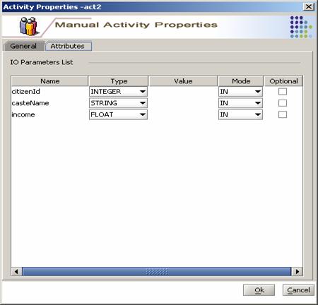
Attributes (Parameters)(Figure 68)
Figure 68:Set Parameters to Manual Activity
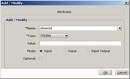
Figure 69:Add Manual Activity Parameters
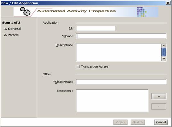
Automated ActivityTo add Automated Activity to Design Panel there are two ways.
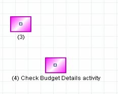
Figure 70:Navigator Showing Automated Activity Figure 71: Automated Activity on Design Panel
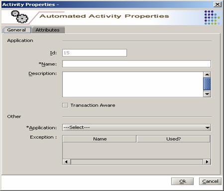
Figure 72:Automated Activity Property dialog (General Panel)
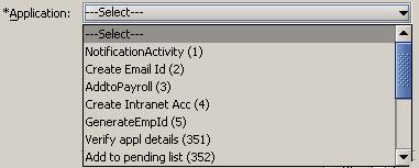
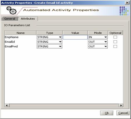
Figure 73:Application which belongs to the Vertical Drop down (Figure 73) shows the list of Application (as explained in Sample Application - New Application) can select any of them. On select of the application its Parameters are populated in Attributes Tab (Figure 72) Attributes Panel · IO parameters of the select application are show with (Name, Type, Value, Mode and Optional) fields. · Value can be entered to only IN mode parameter. In (Figure 74) only for EmpName value can entered.
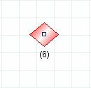
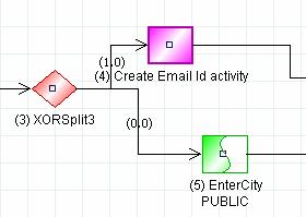
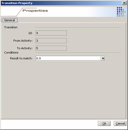
Figure 74:Automated Activity with Attributes Panel Route Activity/Decision Point/XOR SplitAdd Route Activity to Design Editor - Click on Modelling components toolbar (Views - Modelling components toolbar - Route Activity) and then click on Design Panel (Figure 75)
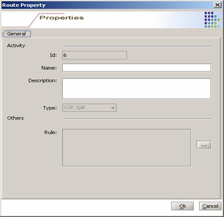
Figure 75:Route Activity In Design Panel
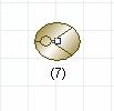
Figure 76:Route Activity Property Dialog AND SplitAdd AND Split Activity to Design Editor - Click on Modelling components toolbar (Views - Modelling components toolbar – AND Split) and then click on Design Panel (Figure 77)
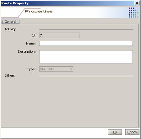
Figure 77:And Split on Design Editor
Figure 78:AND Split Type
Figure 79:Split and Join Activity Properties Dialog
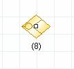
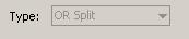
OR SplitAdd OR Split Activity to Design Editor - Click on Modelling components toolbar (Views - Modelling components toolbar – OR Split) and then click on Design Panel (Figure 80)
Figure 80:OR Split on Design Editor
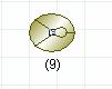
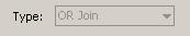
Figure 81: OR Split Type AND JoinAdd AND Join Activity to Design Editor - Click on Modelling components toolbar (Views - Modelling components toolbar – AND Join) and then click on Design Panel (Figure 82)
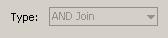
Figure 82:AND Join on Design Editor
Figure 83:AND Join Type OR JoinAdd OR Split Activity to Design Editor - Click on Modelling components toolbar (Views - Modelling components toolbar – OR Join) and then click on Design Panel (Figure 78)
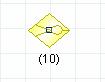
Figure 84OR Join on Design Editor
Figure 85:OR Join Type
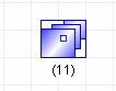
Block Activity (Sub-Process)Add Block Activity to Design Editor - Click on Modelling components toolbar (Views - Modelling components toolbar – Block Activity) and then click on Design Panel (Figure 86)
Figure 86:Block Activity On Design Editor
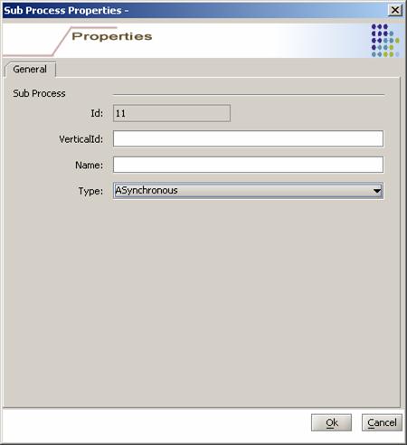
Figure 87:Block Activity Properties
TransitionTransition is the link between two nodes. The nodes can be Start/Stop, Manual activity, Automated activity, Block activity, Route, Split and Join constructs. There are various transition types available in the modeling component toolbar. By default there is no need to select any transition type. Transition can be drawn/linked by selecting the “From” activity, click on the center point (square), drag-and-place of the “To” activity. The transition gets created. In case of other types like deadline transition, remainder transition so on the type needs to be selected for modeling component toolbar and perform the steps similar to creating the default transition and hold the appropriate key specified (Check in toolbar tooltip for the specific transition) while placing on the “To” activity.
1) From AND Split, OR Split, AND Join and OR Join To Manual / Automated Activity (Figure 88)
Figure 88:Transition From Split to Manual Activity
Figure 89:Transition Property Split to Activity
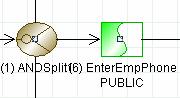
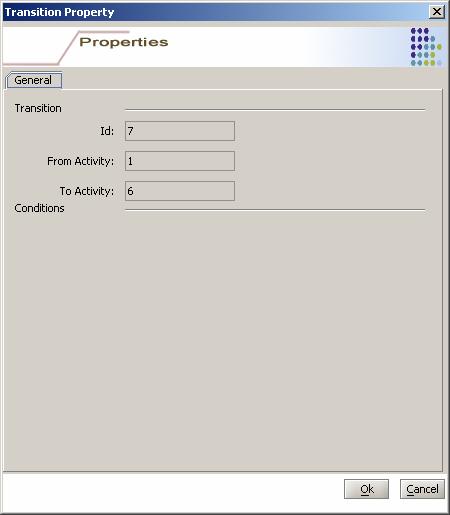
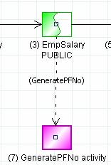
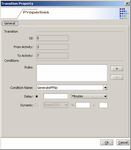
2) From Route Activity To Manual / Automated Activity (Figure 90)
Figure 90:Transition from Route to Manual Activity
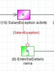
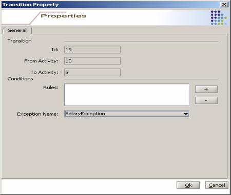
Figure 91:Transition Property from Route to Manual / Automated Activity Exception TransitionClick on the Exception Transition in modeling component toolbar and create the transition by performing the steps for the regular/default transition and place on the “To” activity by holding the “Ctrl” key. After creation, go to the transition properties dialog and specify the necessary values.
Figure 92:Exception Transition
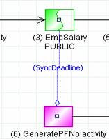
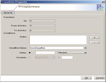
Figure 93:Exception Transition Property Deadline TransitionClick on the Deadline Transition in modeling component toolbar and create the transition by performing the steps for the regular/default transition and place on the “To” activity by holding the “Alt” key. After creation, go to the transition properties dialog and specify the necessary values.
Figure 94:Dead line Transition
Figure 95:Deadline Transition property
Figure 96:Deadline Transition with Dynamic
Reminder Transition
Click on the Remainder Transition in modeling component toolbar and create the transition by performing the steps for the regular/default transition and place on the “To” activity by holding the “Shift” key. After creation, go to the transition properties dialog and specify the necessary values.
Figure 97:Reminder Transition
Figure 98:Reminder Transition Property
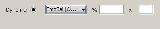
Figure 99:Transition Property with Dynamic Save ProcessProcess can be saved in two ways. The process will get saved in the local machine.
Figure 100:Save Button to Save Process
Run VerifierSame as explained in Tools – Verifier
Simulate ProcessSame as explained in Tools - Simulator
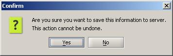
Save to ServerTo Save the process to the server, click on the menu bar File -> Save To Server. It asks for Confirmation and on confirmation saves the process to the server. In case of existing process, there is an option for incrementing version / saving as a new version. Once the process is saved on the server, it is in “In Process”, meaning the process is not available for deployment thru GSi Administrator tool. The process needs to be made deployable, which is explained in the next step.
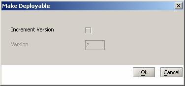
Make DeployableBy default, when a process is saved onto the server, it is saved in “In Progress” state. To make the process deployable, use the “Make Deployable” function. When the user makes the process as deployable then it is available in the GSi Administrator Tool to deploy it on to GSi and then can be used to invoke the process. Menu Bar (File -> Make Deployable) On click of the Menu Item (Figure 101) dialog appears to ask for Version increment and shows the current version of process and its not available to modify. Click Ok to make deployable and Cancel to Exit. Figure 101:New Process (Make Deployable) Create New Application (Auto-Activity Definition)New Application thru Wizard
Figure 102:Vertical Selection from Navigator View
Figure 103:New Application Button
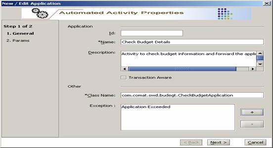
Figure 104:New Application Wizard
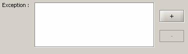
1. Id - (Which is system generated) Once it get saved. No User Input Needed. 2. Name - Name for new application enter in Name field 3. Description - Description for new application enter in Description field 4. Transaction Aware- 5. Class Name -Enter Class Name (including the Package structure) in Class Name field. 6. Exception -Exception can be handled by the application. (Figure 105)
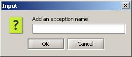
Figure 105:New Application Exception Field To add Exception click on “+” button (shown in Figure 105 with Red circle). Then Figure 106 appears to add exception to List (Figure 105) To remove Exception from the list of Exceptions. Select and Click on “-“ button (shown in Figure 105 with Blue circle)
Figure 106:New Application Exception Add Dialog
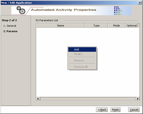
Figure 107:New Application with Data Filled · Second Step Parameters (Params)
Figure 108:New Application Parameters
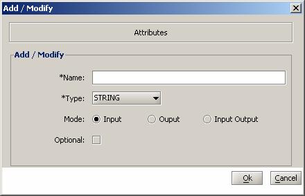
Figure 109:New Application Add Parameter To add Parameter to New Process Enter following details. 1. Name - Name of Parameter In name filed. 2. Type - Type of Parameter select from drop down. (Figure 110) Figure 110:New Process Add Parameters dialog Parameter Type 3. Mode - Mode of Parameter Input, Output, I/O 4. Optional - Optional Parameter to Process 5. The Select OK to add Parameter to List and Cancel to exit the dialog
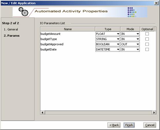
Figure 111:New Application Parameters with Example values
Figure 112:New Application Save Confirm
Figure 113:Application Saved and Showed in Navigator
ExitPrompt For Exit
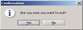
Figure 114:Exit User can set the prompt on Exit option Yes / No from Preferences (Tools - > Preferences) (Figure 115) Figure 115:Prompt for Exit (Preferences) If Prompt for Exit is selected/turned-on in the preferences, (Figure 116) the prompt confirmation window is displayed for user confirmation.
Figure 116:Exit Prompt User Save Process before ExitWhen user selects to the exit the Modeler, the save window Figure 117 appears if there are any process that needs to be saved. (i.e. modified files but not saved) Figure 117:Save Process before Exit 1. Figure 117 shows list of Process which needs to save. And also has four buttons to perform action. 2. Save - Saves only selected process from the list. 3. Save All - Saves all process from the list. Irrespective of the selection. 4. Discard All - Discards the save and exit the Modeler. 5. Cancel - Cancel the save and also the exit action of Modeler. Won’t get exit form Modeler. |


 means ask / prompt while click on
Exit
means ask / prompt while click on
Exit 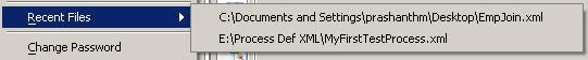


©2004-2009 Comat Technologies Pvt. Ltd.